Design System - A Beginners Guide
7 Min read

With the increasing demand for IT solutions and the ever-evolving app development market, there has been a paradigm shift in UI trends and methodologies. While previously the world was gaga over the unique design approaches, the designers with the increasing need for faster go-to-market are rooting for design systems to meet the speed of the market.
Design Systems are to help designers create uniformity across different IT products from a brand and a series of components that they can reuse in practically all the products that they design. Basically, they have created design systems where that accommodate style guides, component libraries, and other such reusable design essentials that can accelerate the design process.
Understanding Design Systems
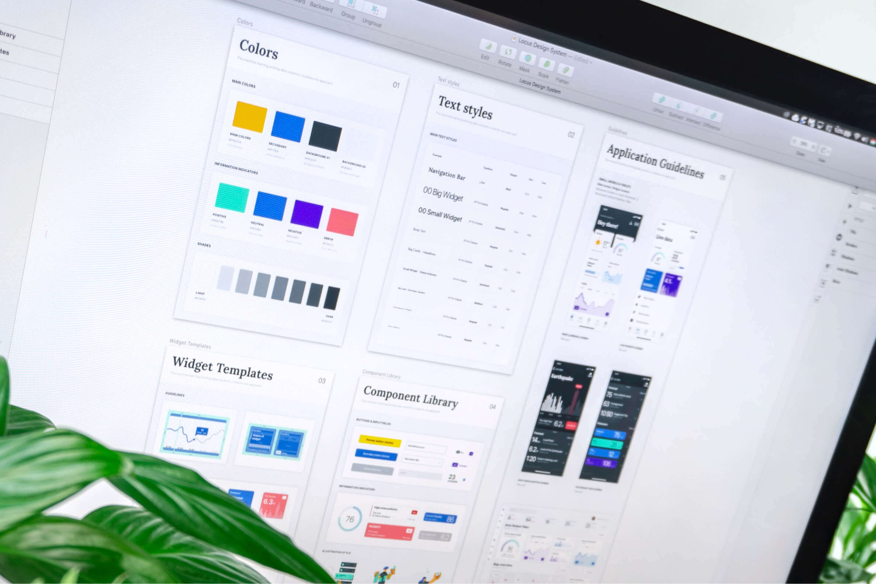
If I am to simplify design systems, the idea is to create a toolkit and a guide for designers. Everything can be a part of a design system, from the small elements such as a button or a text style to various components of a landing page such as content structure and page templates.
The purpose of such design systems is to guide designers in a manner that accelerates the design process by creating uniform design and process components that can be reused across all platforms and solutions. Thus, when you create one such library where a designer can find all the relevant design components that can guide them in constructing the UI of an IT solution, it is called a structured design system.
A structured Design System is a capability provided across all the reputable UI design platforms. A few examples of structured design systems that are widely used by designers are Atlassian Design System, Google's material design, IBM's Carbon, Shopify Design System Polaris, MailChimp's Voice and Tone, and others. While there are standard libraries that designers can adopt directly for their solutions, designers can also create their own design system for brands that launch multiple products under their brand.
But, how and when can we create a design system? What are the foundations of an exemplary design system? Well, there are certain principles and specific methods that are used to develop design systems, and they can be as follows:
When and how to plan a design system?
To avoid confusion and to ensure that you can create a reliable design system, there are certain principles that must be kept in mind while conceptualizing a design system. Three crucial such principles are as follows:
Three (3) basic principles to follow while creating a design system
Create design standards first
If an organization has not decided on the design style of components such as a navigation bar, buttons, fonts, and others, creating a design system with multiple style guides can rather generate confusion among the designers. Thus, the first step is to identify the design style that a brand wants to follow, and then based on the finalized designs, you can create a design system whose components can be reused across all brand platforms and IT solutions.
The design system must guide the designers
The least that a design system must do is guide the designers with a common language that designers must implement during the creation and life of a product. Thus, it is essential that the design system that you create must have a specific set of standards that act as a source of reference for all the products of a brand.
The design system must accelerate the design process
The whole point of creating a design system is to help designers avoid the time in designing and building components that are uniform across all the brand platforms. Thus, instead of creating a design library with complex features and processes, it consists of small design elements and components that designers can reuse easily and accelerate the design process by saving significant time and effort.
Now that we understand the purpose of an ideal design system, it leaves us with the last and the most crucial question, how can I create a design system? Well, in my opinion, the two best methodologies to develop Design Systems are Atomic Design and Sketch and Design Framework methodology.
Exploring the methodologies of creating a Design System
Atomic Design
The idea is to start working on the smallest of design components and then move up the scale with the increasing complexities. Introduced by Brad Frost in 2013, the idea of Atomic Design is to create different building blocks that co-exist in a product and across all brand platforms. The usual hierarchy of components moves from the basic building blocks to creating tangible UI elements to complex structures and, lastly, page-level objects and complete landing page templates.
For all the tools that you can use to create an Atomic Design System, the hierarchies in the design system are also given terminologies based on their roles. These terminologies and their roles are as follows:

Atoms
Just the way atoms are the basic foundation of any living organism, the atoms are the building blocks of Atomic Design. In this, designers define a standard text style, buttons, color, grid, gutter, or other elements that can be kept uniform across the product.
Molecules
Once you have the atoms ready, you can then combine these atoms and create a molecule. This design system means creating different tangible UI elements such as a search form by combining the uniform button and the text field.
Organisms
When more and more UI elements are combined, they create a physical structure which is known as an organism. For instance, when you integrate the search field with the navigation bar, you get a header for a website.
Templates & Pages
With the help of such organisms, designers can then move to more complex design standards, such as creating a standard dashboard template with the header and other page-level objects that can directly become a part of the final product.
Design Framework
Similar to Atomic Design, you move from the most minor component to the more complex ones. But, there is a change in the perspective here. The Design Framework starts with the most common UI elements that are omnipresent across the entire artboard of a product and then to the other standard components and modifiers.
Thus, the Design Framework hierarchy can be as follows
Color
The most common thing that is present in all the design elements, irrespective of their role, is the color of the component. Imagine if you have already created the entire artboard, and then the stakeholders decide to change the color of the button to a darker shade, and now you have to make changes on 300+ screens? The process can be nerve-wracking; the design framework creates the color guide as the very first step of the design system.
Finalize the primary colors that define the brand image and then move to secondary colors for different backgrounds, typography, and others. Moving forward, you can also define standard system feedback colors, such as colors for displaying system messages, notifications, pop-ups, warnings, and alerts.
Design Grid
Once you have the color finalized, you can move to the product's design grid. In this stage, you pick one of the vertical or horizontal grid approaches and create a standard format for placing all the UI elements on a page.
Modifiers
Once the color and grid are standardized, you can move to the next level on the hierarchy, which are the shapes and shadows of all the UI components. While these symbols are not unanimous across the product pages, changing them during the later stage of designing can lead to tiresome work.
Thus, you must define different shapes and shadows of UI components such as buttons, input components, form fields, and others. When you have a design system for modifiers, even if you decide to change the shade during the later stage, you can move to the basic shape of the component, make the changes in its style, and everything connected to that shape will be updated automatically.
Defining Typography
Moving up in the hierarchy, typography is the last component commonly present in the design framework. Create a standard design style and size for all the H1, H2, H3, H4, H5, and H6 headings, static headers, and other components such as button labels and background designs. Since there are a lot of different sections to be considered, you can create 2 or 3 variations for the designers to choose from and help them accelerate the typography of the brand product.
Components, Icons, and Sections
Moving with a similar mindset, you can expand your design framework with standard framework protocols for different informative and user-interface icons, buttons, input fields, and other complex components and also define standards for the most common sections of applications and websites such as About Us, Contact Us, Sign Up and Registration and others.
It all boils down to the commonality and hierarchy of components
If you are to create your own design system, the idea must not be to force a designer to pick a stringent design path. It is instead providing them the opportunity to spare time in creating unique design elements while saving that time in designing the most common components of the IT product. It also acts as a guide that helps designers understand the standard UI components that create a collective brand image.
SHARE :
